Likert Scales
Project for a university department.
Likert scales are a staple survey tool, but conventionally visualized as boring, ugly side-by-side or stacked bar charts. A university department approached me with a challenge: they wanted to publish the result of their annual climate survey in a visually appealing, aesthetically congruent format. The department also requested that their Likert visualizations would preserve the detail of the data while still allowing for
at-a-glance analysis.
Inspiration:
Recently, I have been experimenting with tessellations and repeating patterns. I was inspired by the shape of the repetition in a visualization by Federica Fragapane that I found in this article.
Visualization Variations
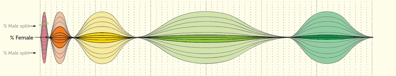


Customizable & interactive version

The same department came to me the following year (2021) to ask for a visualization of their latest climate survey data.
Instead of altering my 2020 visualization by hand, I created a program to do so using d3.js.
Check it out here :))